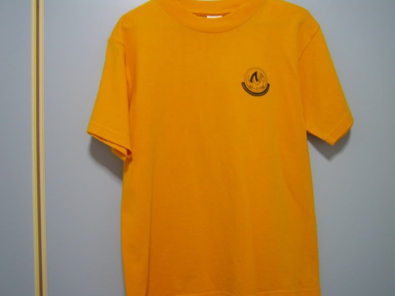
Front of the Secondary One Camp T-Shirt
Left:mine,Right:my younger brother's
Back of the Secondary One Camp T-Shirt
Left:mine,Right:my younger brother's
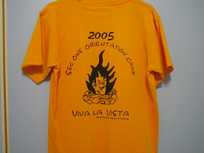
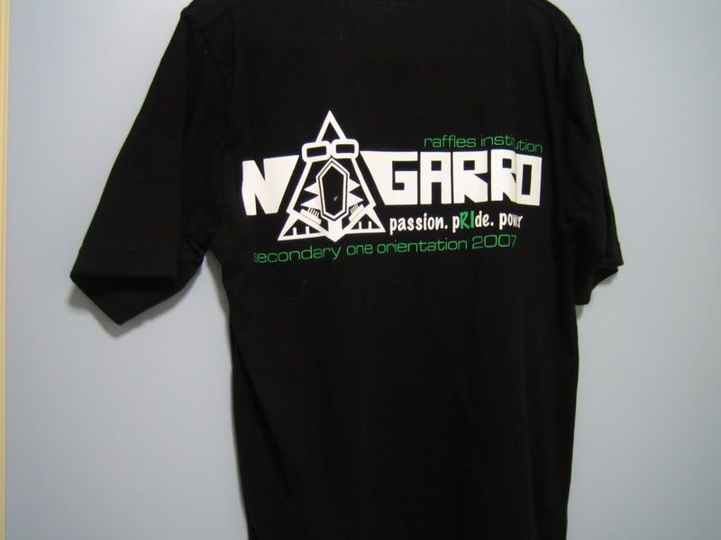
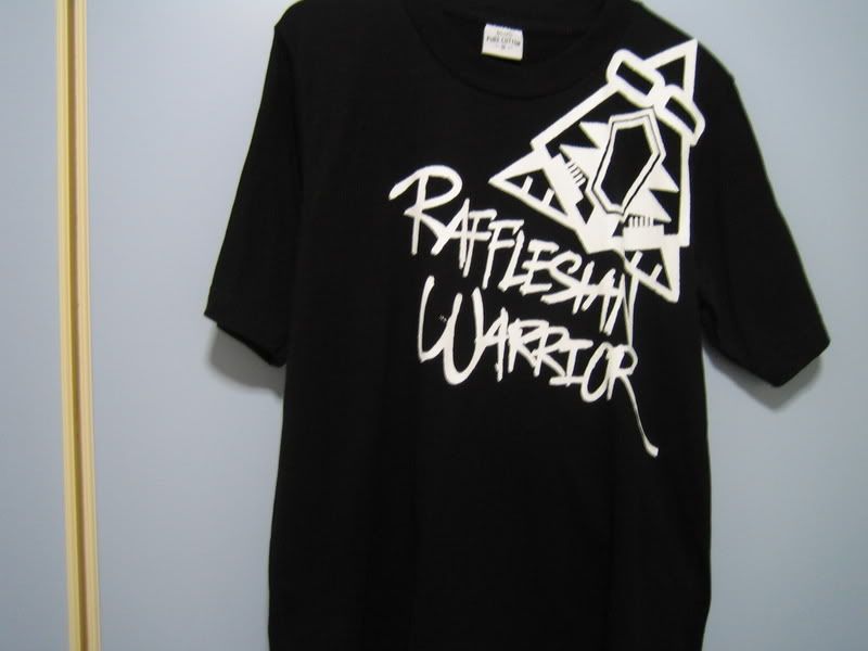
so can you see the difference now??? of course it isn't that i complain that my camp t-shirt design is ugly...after all, it's designed by our art teacher as well...but if you were to wear this shirts on street, black will be definetly a plus colour to choose from when designing t-shirts. after all, the colour black is never hard to match with clothes and it is no doubt the IN colour. i am just keeping my fingers crossed with hope that my secondary three camp t-shirt WILL be something cool like my brother's camp t-shirt!!! teachers or whoever is designing our shirts, can you hear our pleas???
it seems that even their crest design is better than my school! well that can't be help i guess as my school was originally a chinese school so maybe their imaginations and creativity are not as good as whoever who designed my brother's school crest? looks like i have to bring in pictures for you all to see again so as to get a clear idea of what i am talking about...
Left:brother's unmodified crest(pin),Right:brother's colour modified crest on school's Polo shirt.


Left:modified brother's black and white crest on school's notebook, Right:my school's crest(pin)
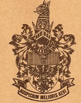
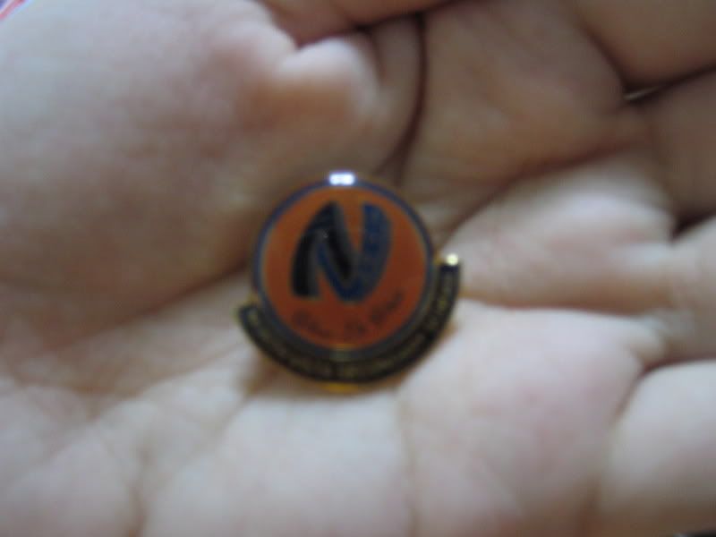
the above crest mentioned with (pin) are the school crest pins which we pinned on our uniform respectively.
there are two different crest for my brother's school. the one on the far left is the unmodified original crest created years ago. the one on the centre left and right are the school crest which are modfied to make it look nicer. i love both of the modified school crest. the design makes me think of the crest for old castles in fairytales. a really dreamy and beautiful crest....why couldn't i have such a nice crest like that??? perhaps it's because that my brother's school have a longer history than my school??? who knows? well, anyone is a genius to have design such a pretty crest!^0^
i guess that i shall blog until here today...hope that you all enjoy reading this post and looking at the pictures i taken!
No comments:
Post a Comment